What a Client Decides About Your Website in the First 5 Seconds
Your website is a shop window, and a visitor sizes it up in 5 seconds. Here is what a client looks at first, and how to pass that test before they close the tab.
You walk down the street and pass a shop window. One glance is enough to decide whether to go in or keep walking. You do not read every price or count the products on the shelves. You just feel it: "this is for me" or "this is not for me."
Your website is exactly that same window. It is just open day and night, and the visitor's glance is even shorter. He does not give you a minute. In the first 5 seconds he decides whether to stay with you or close the page.
In the next 3 minutes I will show you what a client looks at in those first 5 seconds, and how to pass that test.
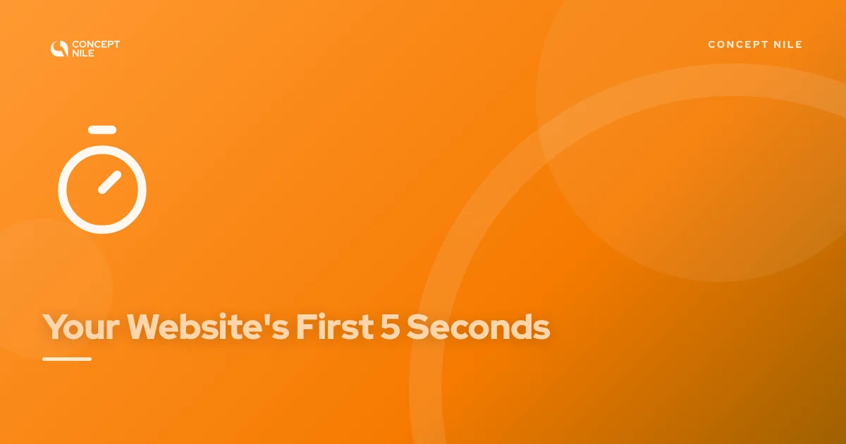
The first 5 seconds decide everything
When someone opens your site, his head asks three questions almost instantly: where did I land, is this for me, and will I quickly find what I need. If the page does not answer right away, he leaves.
This is where many sites lose. They talk about themselves instead of the visitor's problem. "Welcome to our website", "Our company was founded in 2015", a pretty photo and a vague slogan. Meanwhile the visitor still cannot tell what exactly you offer or why he should stay.
The person opening your site cares more about his own problem than about your company history.
You might ask why people leave so fast. Because one click away there are a hundred other sites. If he does not find an answer with you quickly, he simply moves on to the next one. It is not cruelty and it is not impatience. That is just how the internet works.
1. Check whether your first screen answers the main question
Open your site and look only at what shows before you scroll. That is your shop window. Now imagine you are a stranger seeing it for the first time.
In 5 seconds, can you tell what this site sells and who it is for? If the answer is yes, you passed the test. If the first screen only shows a logo, a big photo, and the word "Welcome", then the window is empty.
A good first screen says three simple things: what you do, who it is for, and what to do next. No more, no less.
2. Make the next step obvious
The moment a visitor realizes he landed in the right place, he should immediately see what to do next. Call, message, order. One clear step.
Many sites lose the client right here. The phone number is hidden somewhere at the bottom, the button is invisible, or the opposite, the page offers ten things at once and the visitor gets confused. And a confused person does not buy. He closes the page.
So show one main action and make it impossible to miss. One clear button always beats ten vague links.
The bottom line
The first 5 seconds are not about beauty, they are about clarity. A client will not stay on a pretty site that confuses him. But he will trust a simple site that answers him right away.
A pretty site that confuses loses. A simple one that answers right away wins.
So next time, before you open your site, imagine for a second that you are seeing it for the first time. What would you understand in the first 5 seconds?
Talk soon,
Rati
P.S. Curious what we'd do for you?
Get in touch today, and if we're a good fit, I'll personally sketch out a plan of what can be improved for you, then walk you through it in detail on a call.
After that, if you want to work together, I'll tell you where we start. If you don't, that's no problem either.
No pressure, no awkward moments.
Sound good? Then fill out the form and we'll get back to you with an answer within 24 hours.